In digital marketing, the call-to-action buttons play a vital role. A great copy to an impressive landing page, everything in this space is worthwhile if it grabs the attention of the audience and provokes the action. The action could be of any type such as to buy, free download, free membership, or get access.
What is Call to Action (CTA)?
In simple words, call-to-action or CTA is a clickable button or image attached to the link and intended to encourage the visitors to take a certain action. For instance, to enter the sales funnel, to sign up for a free product, or join a newsletter for updates.
Suppose you’re a company.
You’ve launched your website.
Question: What would you expect after that?
Answer: You would definitely want visitors to come and buy from you.
Exactly…
Is it that simple?
Let’s dig in to find out what it takes to get the visitors and convince them to take the action.
3 Step Process of Convincing Visitors Into Customers :
Arrival of the Visitors
It’s important to figure out how your website visitors are arriving. It’s not just what you are doing to get the visitors, but it also matters that where and why they are coming to your website. The intention counts because if they are continuously coming on an article which you just randomly posted and has nothing to do with your original product, then you might need to work on it and try to publish the content related to your product.
Convincing them to take Action
The convincing process takes place automatically after the landing of the visitor. It depends on your campaign that where your visitor lands. If you’re using a landing page or directly working on your website’s homepage, then make sure it contains the arsenal to convince the visitor to sign up for the offer.
The Process of Conversion
The process of conversion is the last step of this short funnel. It more or less depends on the quality of engagement of your website or landing page. The message, graphics, and the offer collectively work to engage the audience to finally go with the decision to take a certain action.
This article from Hongkiat discusses the types of call-to-action buttons and tells the importance of using the different call-to-action buttons for different brands. They collected a variety of buttons to showcase the different types of CTAs.
Last year Facebook made an update to its Page management and added a call-to-action button option to the pages. This update was highly appreciated by the page owners because it somehow increases the fans engagement and conversion rate.
6 Essential Elements of a Powerful Call-to-Action Button
Following are the important elements that make any call-to-action button effective in order to achieve the desired goals:
Size
No one can guarantee you that which one is the best size for a call-to-action button. It purely depends on the situation. Analyze the location, website, and area, then decide what the size should be.
Shape
Similarly, there can be a dozen of shapes for a call-to-action button. Test with different shapes and styles such as square, rounded, oval, and slightly rounded corners etc.
Color
The color is one of the most important elements of a call-to-action button. A call-to-action button in black, gray, and red often show the deniability, whereas colors like green, orange, and blue show positivity for the buttons. Use appropriate colors with respect to your site colors.
Placement
If everything goes right and the placement of a call-to-action button is wrong, then everything you have created and done could go in vain, so be careful where to place the call-to-action button. Normally it comes in the center or after the signup form somewhere on the page.
Text
The text indicates the message you’re delivering. It often makes readers convinced to click on the button. Normally online marketers use texts such as ‘Get Access’, ‘Subscribe’, ‘Free Updates’, ‘Get Started’ and many more. Choose the text of your call-to-action wisely.
Action
The action is the behavior behind your call-to-action. It’s also an important element because it shows what you have to offer and what your intention is. It’s considered very important because most of the times it links with the landing page or a sign up opt-in box.
An article on Wordstream talks about the similar elements. It reveals many other best practices to create an effective call-to-action button.
The graphic plays a big role in the design of your buttons. It’s also necessary to keep the visitors abreast with your website, and in order to do so, you have to utilize every single possibility.
Use button generator tools like:
7 Call-to-Action Examples that Teach us About CTA Buttons
The creation of a perfect call-to-action button comprises a list of things. We have studied some elements and steps to create the action-packed and value-oriented CTAs. One of the ultimate goals of a call-to-action button is to avoid the visitor to go off the hook.
Take a look at these examples to understand the dramatization of call-to-action buttons:
Feedly
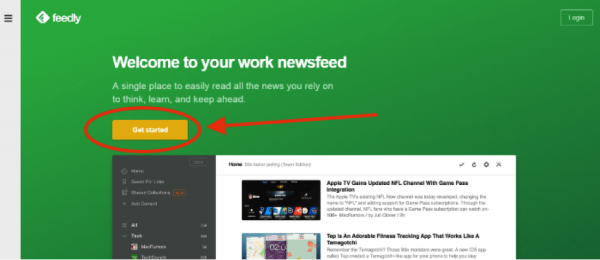
First off, take a look at the Feedly website. Feedly is a popular news reading tool. It helps you to gather news and updates from your favorite blogs and websites.
Feedly has a green website face. It’s simple and elegant. The rest of the area has a white background with different elements on it.
It has a clear yellow ‘Get Started’ button which is attractive enough to engage the audience.
Lesson: The green layout (face above the fold) completely makes sense with a yellow (in contrast color) call-to-action button. It can clearly be seen by the visitors.
Free Online Surveys
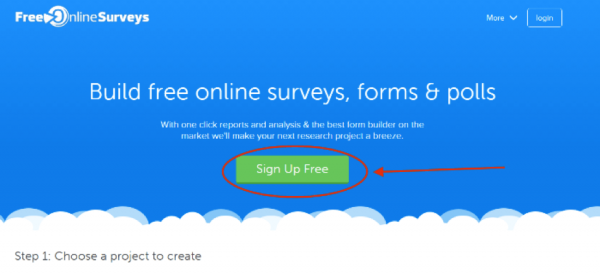
Free Online Surveys is a popular surveys, forms, and polls creation service. It helps you to create surveys and polls pretty quickly. It’s a free tool to use.
This website did the same but with a different website face color.
They have a blue color on the top area with a green call-to-action button.
In fact, they have done one more thing smartly. They have chosen a different place for their call-to-action button. It’s in the middle of the page along with a little bigger button.
Lesson: There are many things in this call-to-action button. Analyze the green color, contrast with the background color (blue), a handsome size of a button, and sensible call-to-action button’s text… They have used the text (on the button) as ‘Sign up Free’ — They have made sure that if their service is free, then visitors must realize that it is free… It could be just ‘Sign up’ but they wrote ‘Sign Up Free’…
It’s a smart move.
SendOwl
SendOwl is an e-commerce system which provides online selling service for your digital products.
It’s one of the emerging online selling tools.
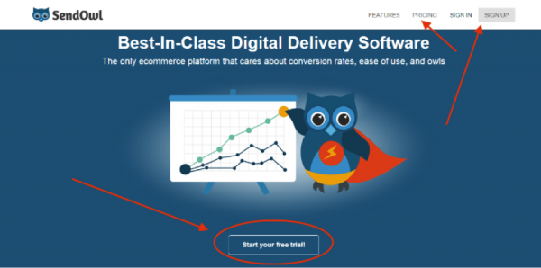
They have got almost everything on their homepage. A couple of call-to-action buttons. The clear message about a free trial. They offer a 30-day trial for free.
Although, they didn’t follow the contrast color CTA button approach and opted to have the same color button with a white outline which makes it clearer to click.
They have done a few things correctly such as the button is wide enough to be seen and comes at the center of the page.
Lesson: This example shows us that if you don’t follow the traditional color approach with your call-to-action buttons, you can still win the chance to attract the prospects by the right placement, size, and text of the CTAs.
Shopify
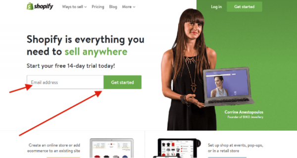
Shopify is world’s popular e-commerce store which provides you a quick start with your own online store. It’s a paid tool with a 14-day free trial to check this out.
Shopify has always been very vigilant as far as their website design is concerned. And surprisingly over the past few years they have tested different home page designs and almost all were pretty impressive.
The current homepage is a bit clean and greenish in color. They have a clear ‘sign up bar’ for prospects to sign up to get started. There is a text message above the sign up bar which says 14-day free trial, it means the person who is entering the email address knows that he/she is going to sign up for a free trial.
Lesson: Shopify did their call-to-action button with a sign up box which is pretty much impressive, plus, they have a white and green layout which looks quite clean. It’s quite easy for them to direct the visitors towards the signup process.
Snappa
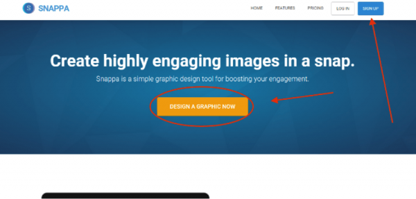
Snappa is a powerful graphics design tool for digital marketers and online content creators. It helps the users to create engaging graphics material which helps the users to boost their content and website engagement.
They have done some good work with the call-to-action button.
It’s pure engaging button.
First off, it comes at the dark blue background at the top area of the homepage. Secondly, they have chosen a yellowish call-to-action button on a dark background which totally makes sense.
Since this is an online graphic designing tool, so they have utilized the opportunity to replace the traditionally used CTA text buttons like ‘SIGN UP, GET STARTED, or CREATE ACCOUNT
by ‘Design a Graphic Now’…
Looks great.
Lesson: Snappa’s call-to-action button is one of the best CTAs I have ever seen to engage the audience. The color of the button might be a strong feature of this button. They have placed two call-to-action buttons on their homepage and both are yellow in color and nothing else on their homepage is in yellow colour.
Welcome Bar
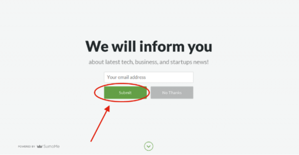
SumoMe is a popular readers engagement tool for online marketing. It provides a variety of tool for email list building and subscribers sign up.
I’ve recently come across their ‘Welcome Bar’ tool…
The ‘Welcome Bar’ is one of the tools from SumoMe.
It has been very effective as far as the conversion is concerned. It doesn’t appear as a popup, instead, it rolls itself from the top of the page and replace the page and reader can sign up or click a down-arrow button to go back to the website page.
It’s completely customizable as far as text, coloring, and behaviors are concerned.
Lesson: It could be quite effective because it provides a chance to choose the background color, then opt-in button text and color, and cancelation button text and color, of course.
Survey Planet
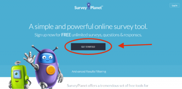
Survey Planet is another amazing survey website. They have a fantastic website design.
It’s blue and they have managed to get a dark blue ‘GET STARTED’ button on the top area of the homepage.
It more or less in the trend to have a call-to-action button at the center of the page.
It’s good because it attracts the visitors.
Lesson: Survey Planet has a simple ‘Get Started’ button in the middle of the header area of the homepage. The color is dark and the button is quite clear on the page. One of the things this example teach us is that you can use a different color within the same color family for your call-to-action button. Just make sure it appeals the visitors.
Conclusion
We’ve seen a list of examples with different call-to-action colors and styles.
These examples tell us that our call-to-action buttons must have a compelling text and intriguing color to attract the website visitors.
It might be a psychological understanding that people might not pay attention to the buttons saying ‘BUY’, ‘PURCHASE’, or ‘SIGN UP’ anymore.. unless they are already aware of your brand or product and have already decided to buy one.
Everything matters in a successful call-to-action button. The text, the color, and the size… You can’t ignore one of them to achieve the best results.
One of the ways to test your on-site clickability is by using the tool like Heatmap to analyze where people are clicking on your site.


