Which factors differentiate a good design from a bad one? This is a question that constantly pinches a graphic designer. While there are no hard and fast rules, there are 5 basic principles of Graphic Design that help to guide the design process. By understanding and applying these principles, you can create visually appealing and meaningful designs.
When it comes to getting the job done, most graphic designers today operate on a design-by-committee basis. Using this approach, they can take into account every potential scenario and produce multiple options in response to each one.
Although there have been some improvements in recent years, Graphic Design is still plagued with issues that prevent it from being as effective as it could be.
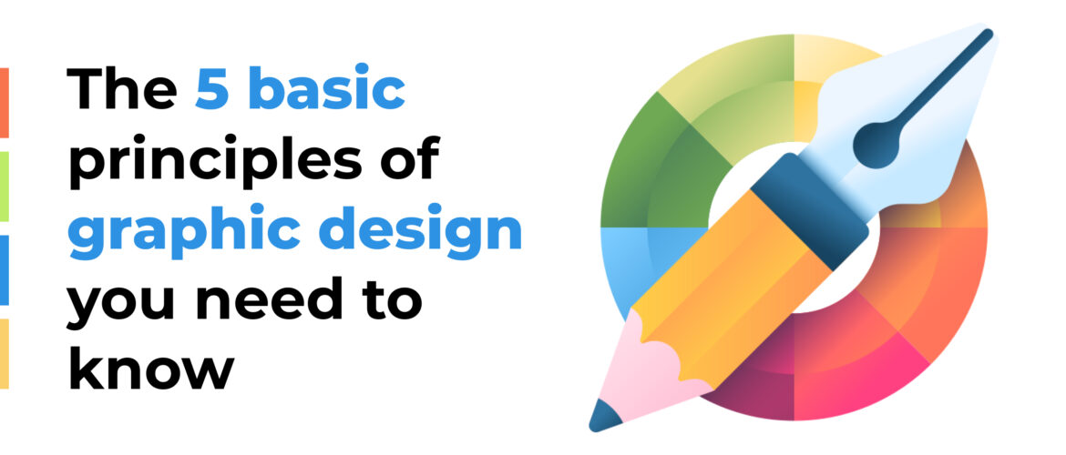
Here are the 5 effective and direct principles that can help you to make your design better;
- Alignment
- Hierarchy
- Contrast
- Repetition
- Balance
Alignment:
The principle of alignment says that all the elements in a design should be perfectly aligned with each other to be more meaningful and engaging for the target audience.
Do you find it difficult to align your focus with the alignment of the graphic? Our eyes can flow freely through the visual message once we have a clear point of alignment within the design.
The Designing Components Should be aligned in such a way It is more visually captivating and portrays the main idea in a more meaningful way.
For Example, the Incorporation of elements aligned haphazardly for either purpose can be a devastating strategy to emerge with a captivating and meaningful design. Perfect alignment gives a greater insight into graphics and their intent.
Hierarchy:
Hierarchy is the principle that governs the arrangement of elements in a design. It dictates which elements are more highlighted and how those elements should be arranged to communicate the design’s message effectively.
The hierarchy of a design can be thought of as a pyramid. The highest priority element is at the top of the pyramid, while the least significant elements are towards the bottom. The hierarchy helps to ensure that the viewer sees and understands the Most Significant elements first.
In most designs, the hierarchy is established through the use of size, color, and position. The largest and most prominently-placed elements are typically considered to be the most important, while the smaller and less focused elements are considered to be less important.
For Example, in a General ad promoting Cereals if you are highlighting more a child with his innocent acts rather than the Cereal’s nutritious significance then it’s a design with zero focus on the Hierarchy Element.
Contrast:
Contrast is the principle that governs the intensity of colors in a design. It can be used to highlight the significance of the design elements used and their role in communicating the message effectively.
The human eye is captivated by the graphics with high intensity. This means that If you want something to be more eye captivating, it is recommended to use high-contrast colors. For example, if you want to highlight a call to action button, you would use a sharp unnoticeable color.
A design with light and dull colors loses the audience’s attention and leaves the motive unfulfilled. So proper implementation of contrast elements in the design to hold the audience’s attention for a longer duration.
Repetition:
Repetition is the principle that governs the usage of repeated elements in a design. Repeating elements are used to synchronize all of the reader’s attention to the most significant idea-focused design element.
Its thoughtful use emphasizes the objective of the graphic clearly in the audience’s mind. Its proper use Compels the Audience to take the desired action more efficiently.
Repetition is essential in multi-page designs, such as websites and magazines. Repeating elements on each page helps to create a sense of uniformity and gives the viewer an overall better experience.
Moderate Repetition of elements should be ensured in the design to grab the reader’s attention for a longer time and to keep the graphic intent clear to the audience.
Balance:
This Principle governs the distribution of visual weight in a design. It can be used to create a sense of stability, add visual interest, or emphasize important elements.
Balance is achieved by distributing the elements in a design so that they are evenly spaced. This can be done symmetrically or asymmetrically. Symmetrical balance is often seen in traditional designs, while the asymmetrical balance is more common in modern designs.
Embedding the graphical representation with excessive graphic elements will give a messy look and confusing intent to the audience so optimal balance should be maintained.
Conclusion:
So here the discussion comes to an end. You can have a brief idea of how each principle contributes to making a more meaningful and eye-captivating design. From the discussion above, you must be aware of the fact that graphic designing is not only creativity, but it’s also the refined incorporation of the 5 Basic Principles of Graphic Design to communicate the message. These 5 principles cater to all your ambiguities and Give your audience a brief insight into the graphics.